Case Study: Wegners
The product:
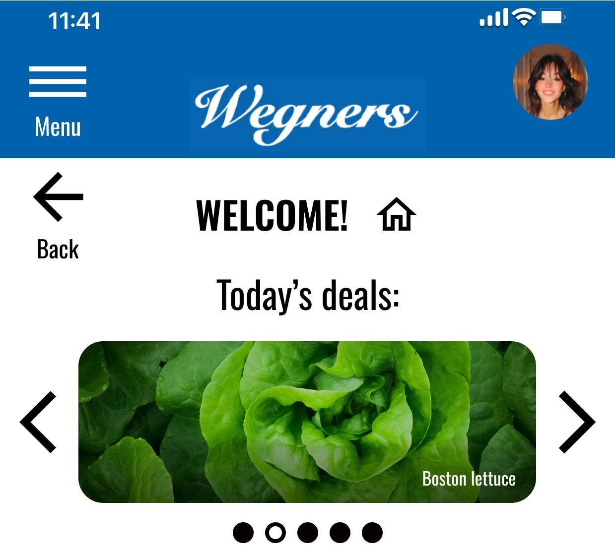
An app for a local grocery store that helps shoppers locate products as they shop in person
Project duration:
February 2026


Project Overview
The problem:
Users need assistance from an app to locate store items more readily
The goal:
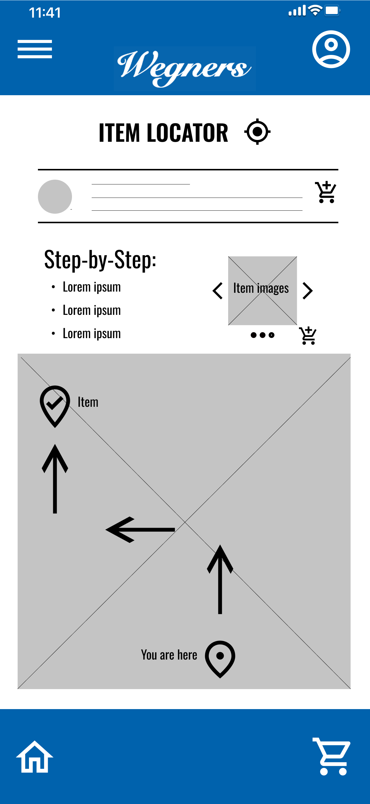
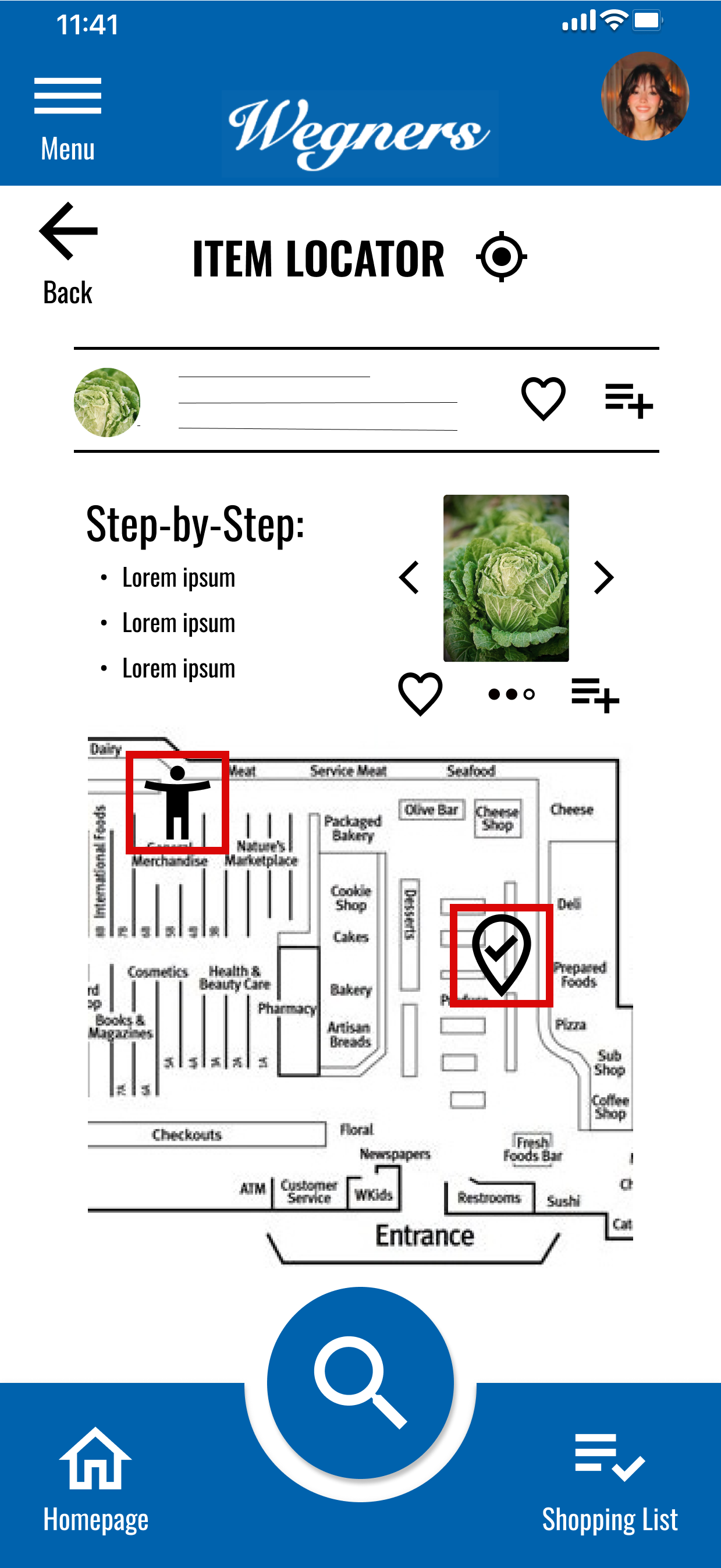
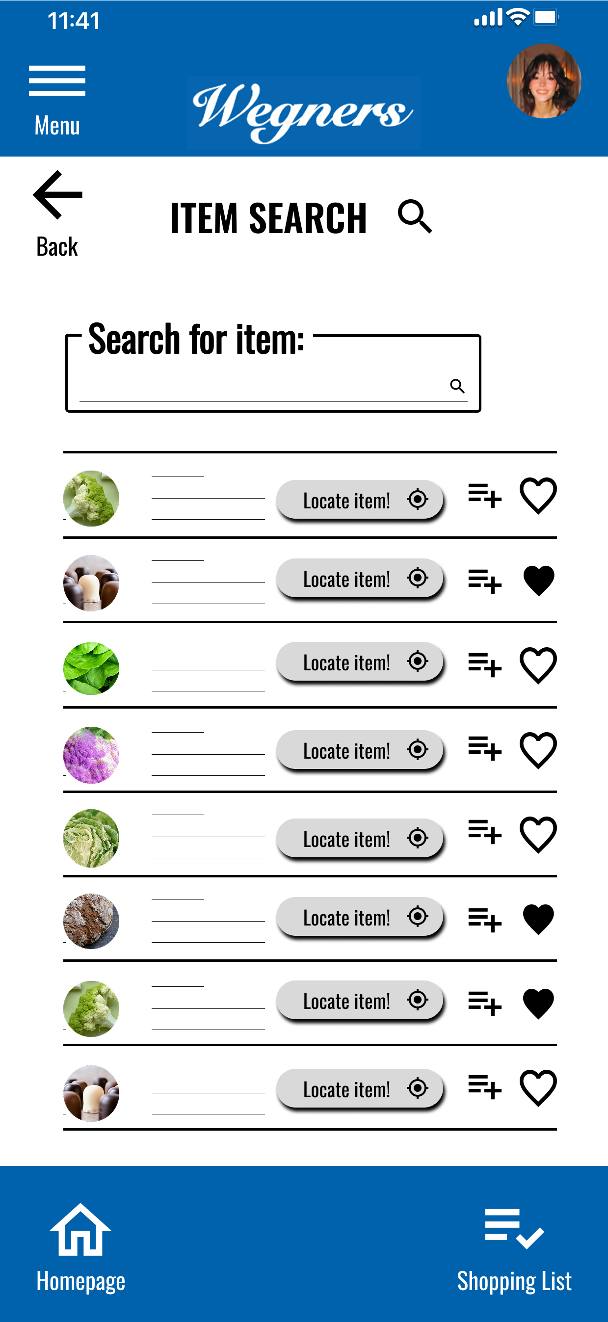
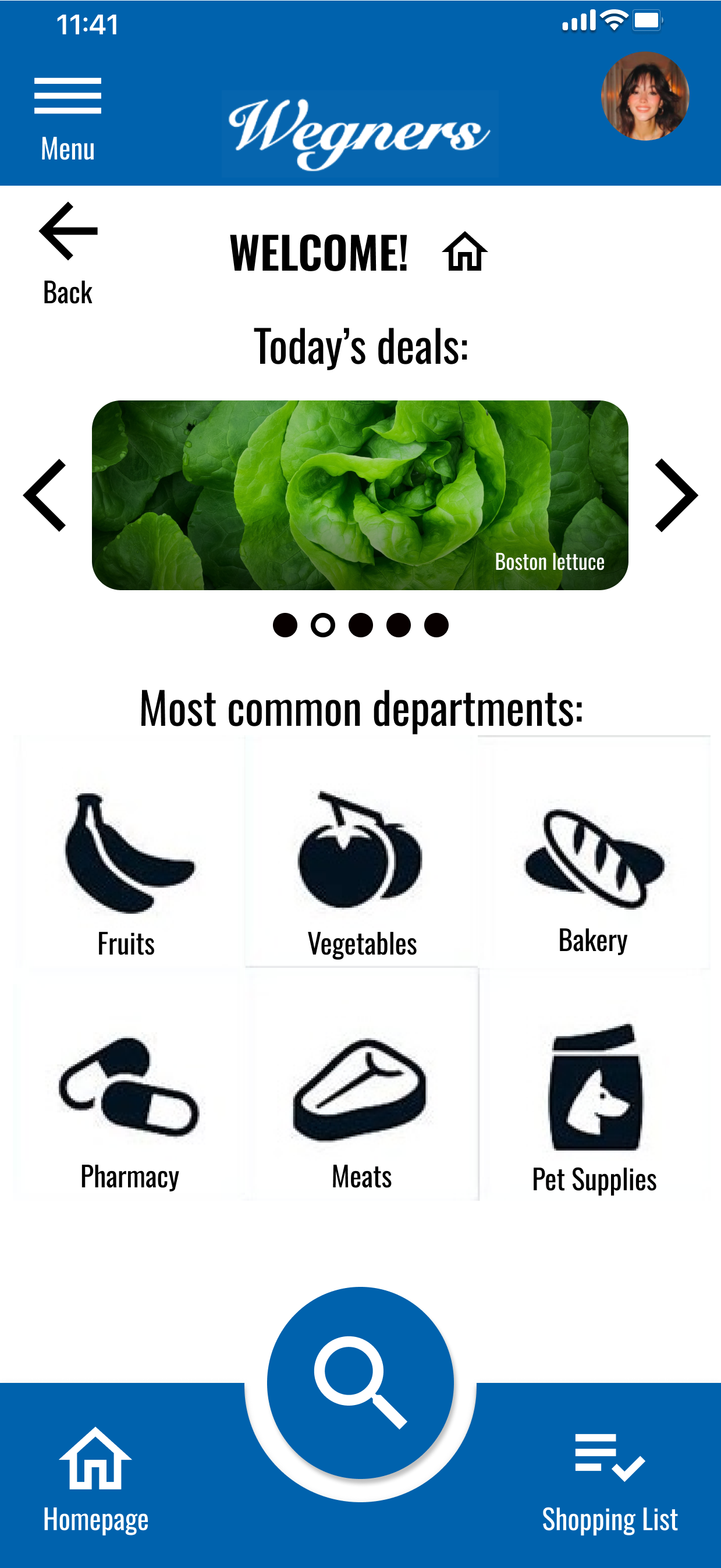
Our Wegners app will let users find in-store products more readily and more quickly by helping them locate the items in advance, mark item locations throughout the store, and provide a location-based in-store positioning guide to help navigate to the item
My role:
Lead UX designer, researcher, & content writer
Responsibilities:
Creating personas, problem statements, and user journey maps
Paper & digital wireframing, mock-ups, lo-fi & hi-fi prototyping, and usability studies
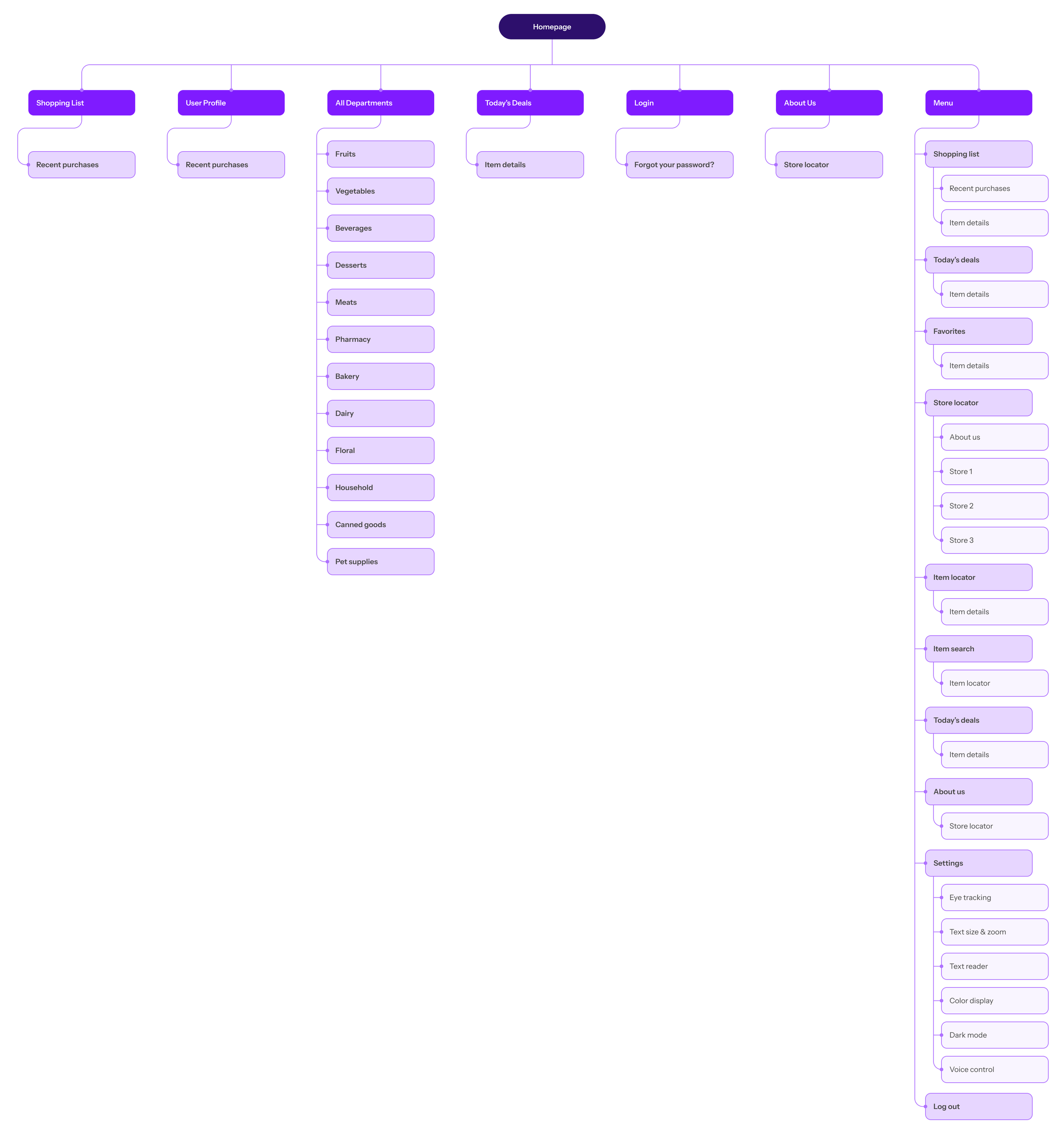
Creating schematic to represent information architecture
Storyboarding, affinity mapping
User empathy mapping
Competitive Audit


Understanding the User
Methods:
User research
Personas
Problem statements
User journey maps
Aims of the interview:
Understand the processes and emotions that users experience around the problem the app will be designed to solve
Identify common user behaviors and experiences with tasks that the product will be designed to address
Understand user needs and frustrations as they relate to the product that will be designed
Pain Points:
App does not offer feature to locate item ahead of store visit
Trouble finding items in-store while hurried, especially after store rearrangements
App does not offer feature to enable in-store location-based guidance to items
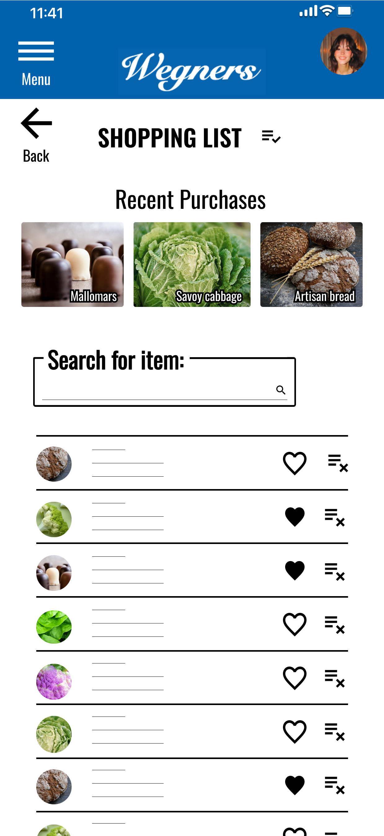
App does not track previous purchases to simplify searching for items on next visit
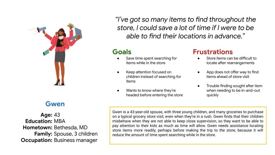
Persona: Gwen
Problem statement:
Gwen is a 43-year-old business professional, spouse, with three young children, and many groceries to purchase who needs assistance from an app to locate store items more readily because it will reduce the amount of time spent searching, and increase the amount of time they have to focus on other more important matters.
User journey map: Gwen
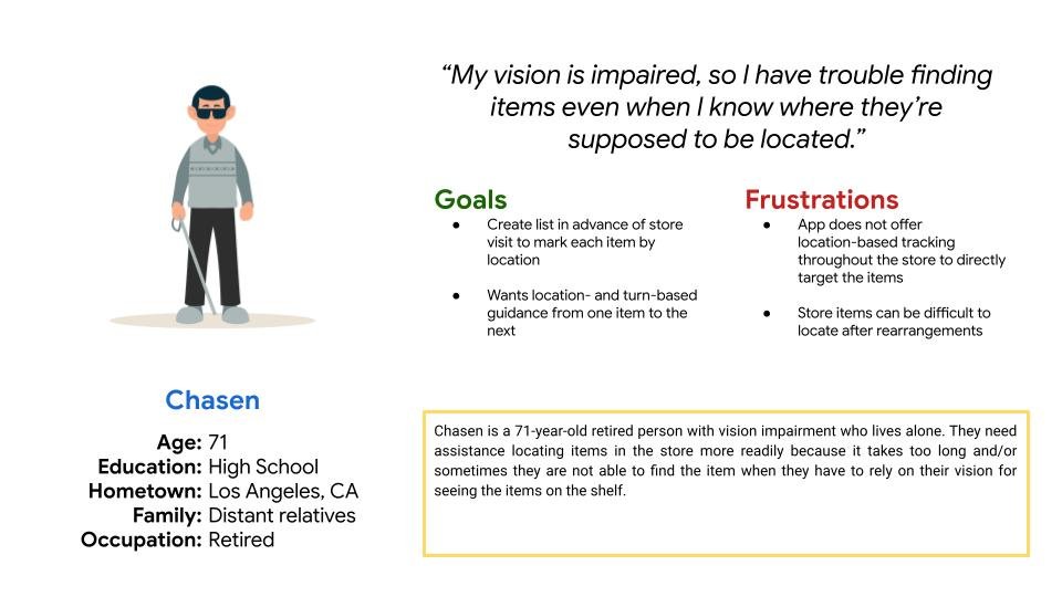
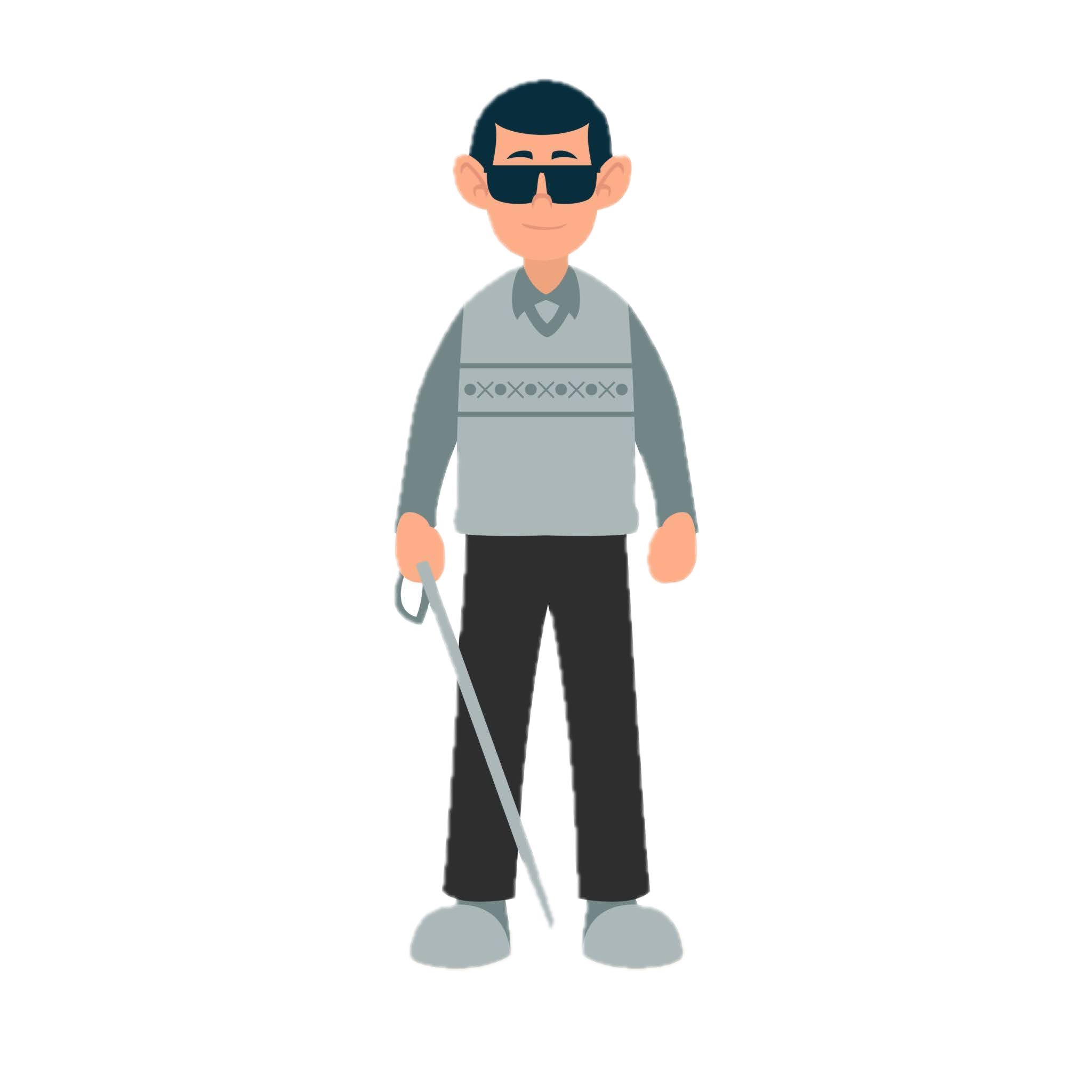
Persona: Chasen
Problem statement:
Chasen is a 71-year-old retired person who lives alone with vision impairment who needs assistance from an app to locate items in the store more readily because it takes too long and/or sometimes they are not able to find the item when they have to rely on their vision for seeing the items on the shelf.
User journey map: Chasen
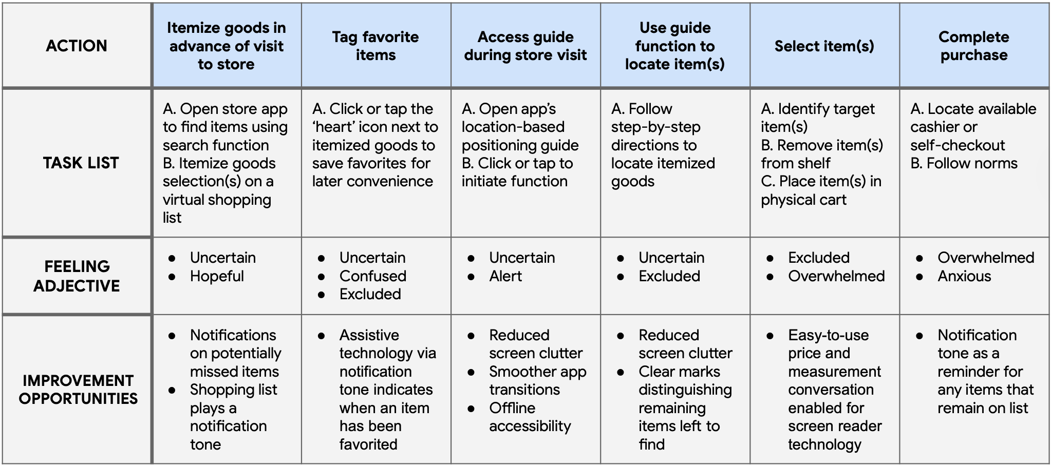
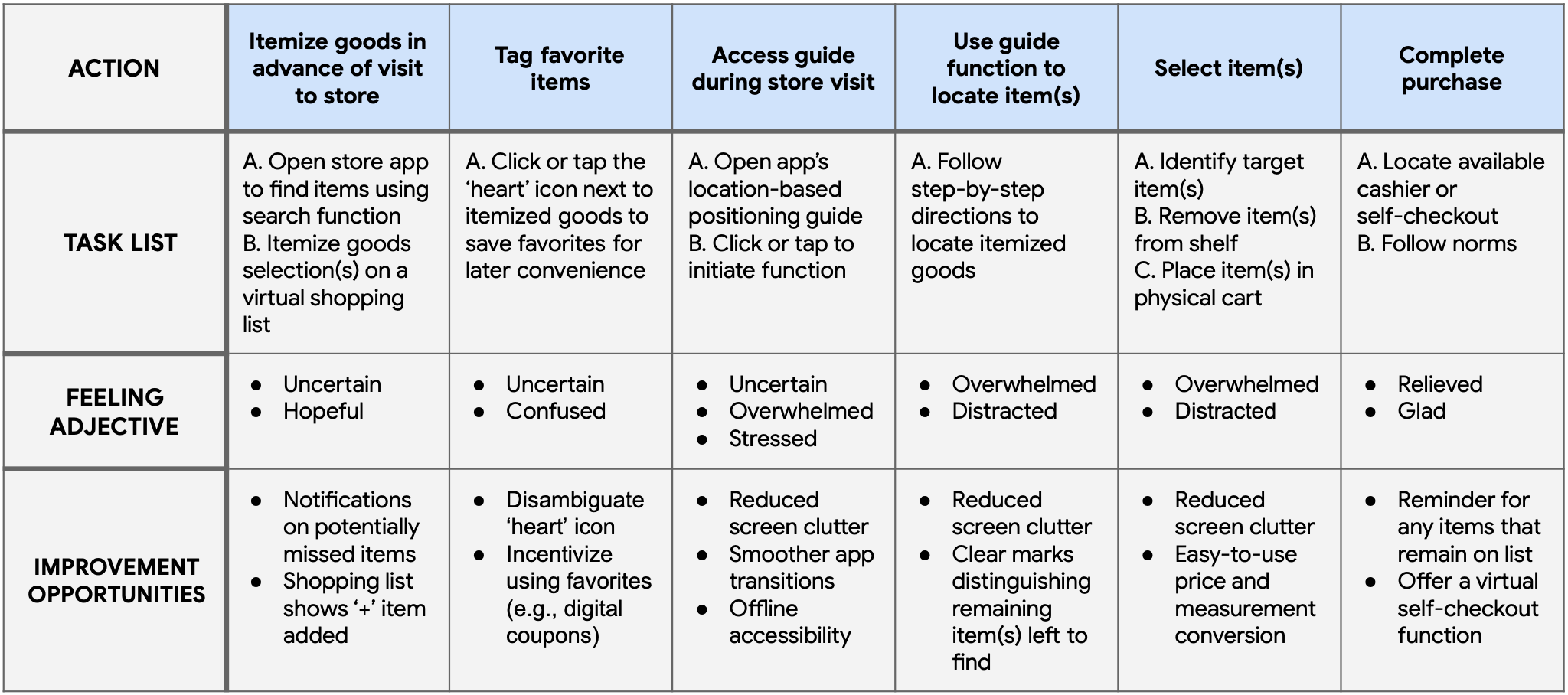
Translating Insights to Design Decisions
Gwen could save a lot of time by using an app feature that tracks previous purchases; this would simplify searching for items on their next visit
Chasen’s needs inspire a design solution that will offer location-based tracking throughout the store to directly target items
Gwen, Chasen, and others like them would have an enhanced experience with an app that offers the feature to locate items ahead of visiting the store
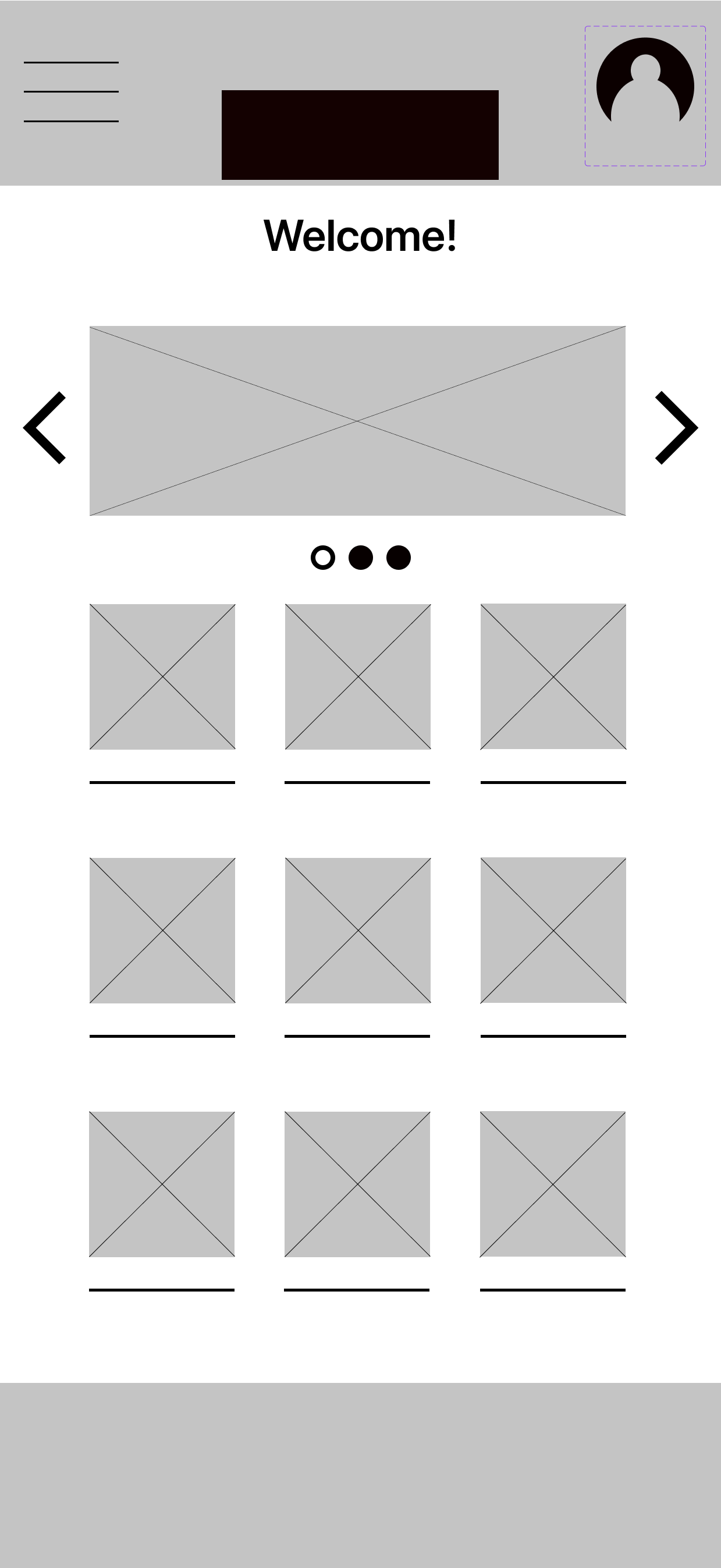
Starting the Design: Paper Wireframes
What are the problems users face with the app in its current state?
What would the app need to be able to do to reduce the friction?
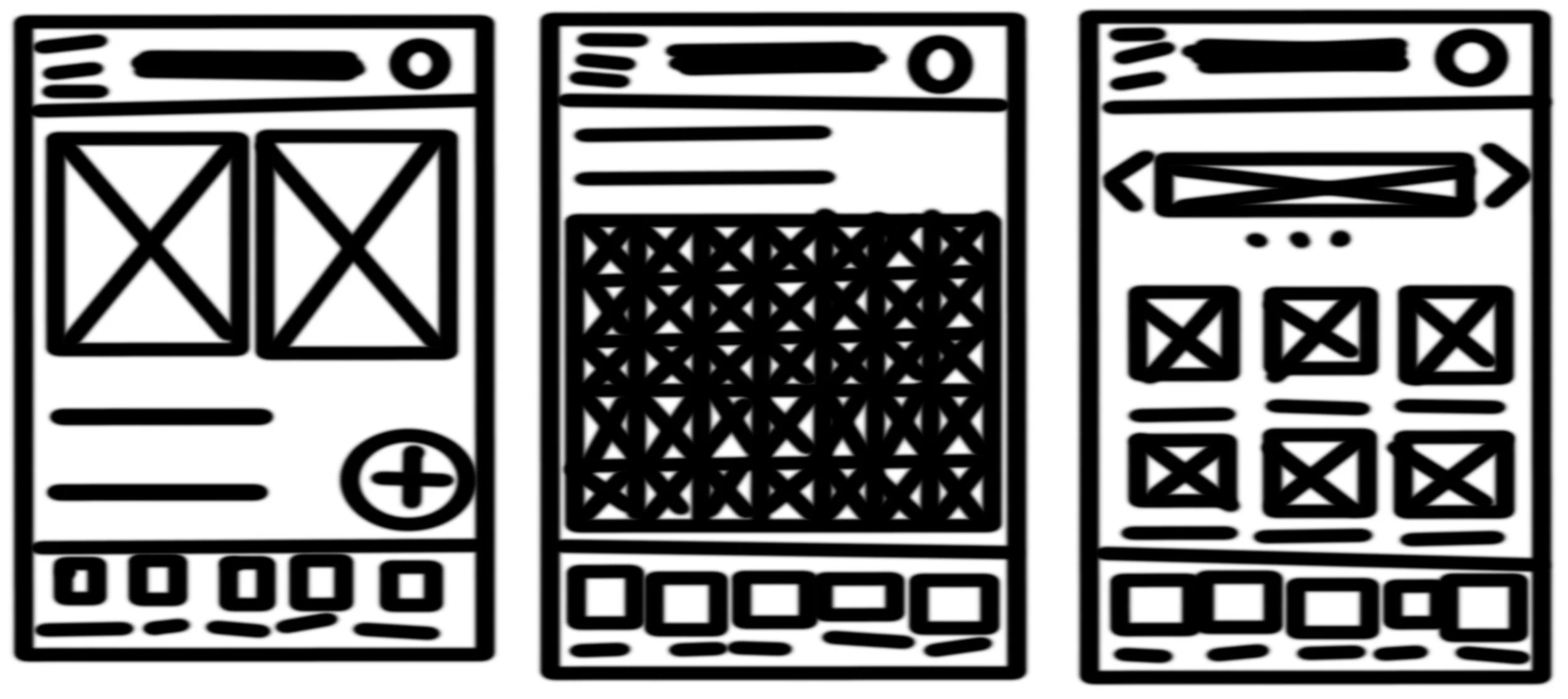
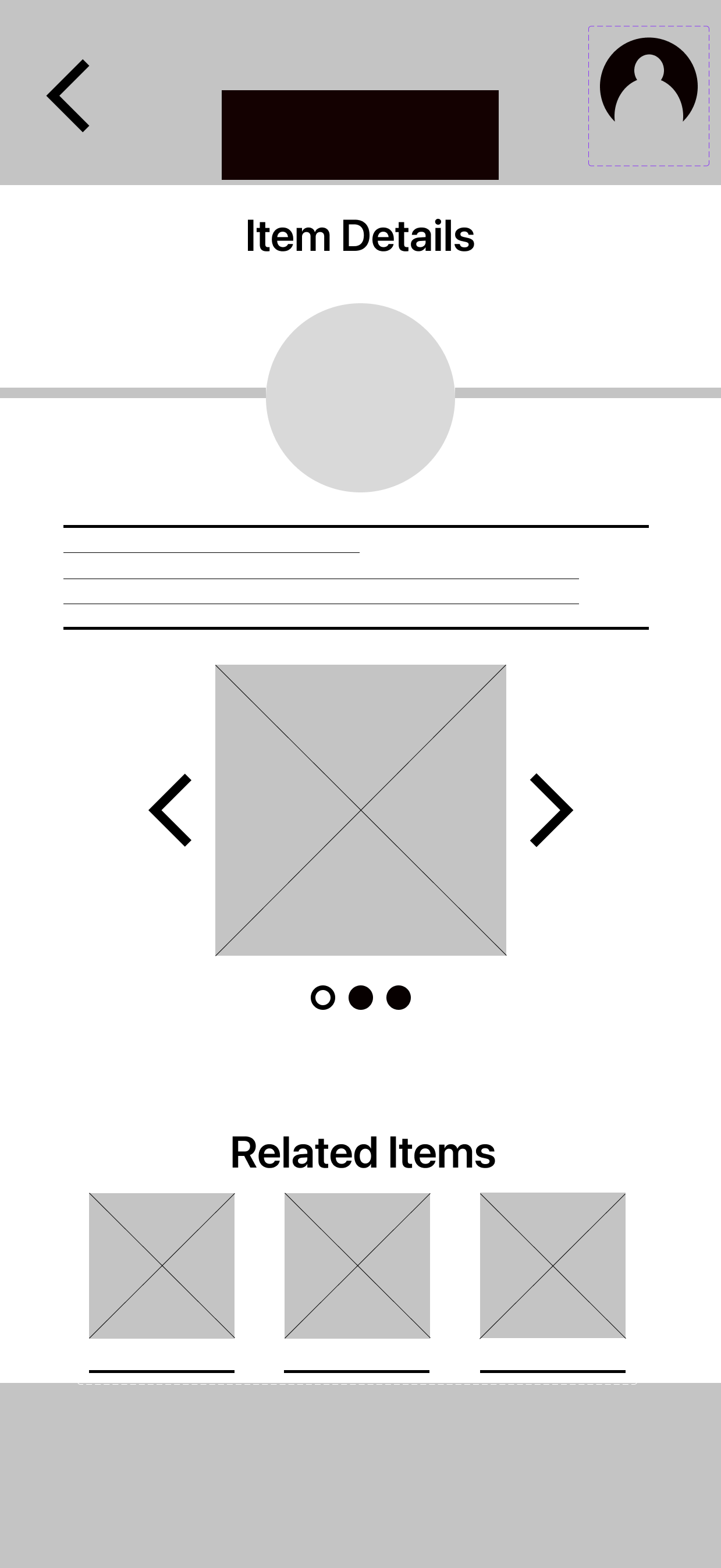
Digital Wireframes
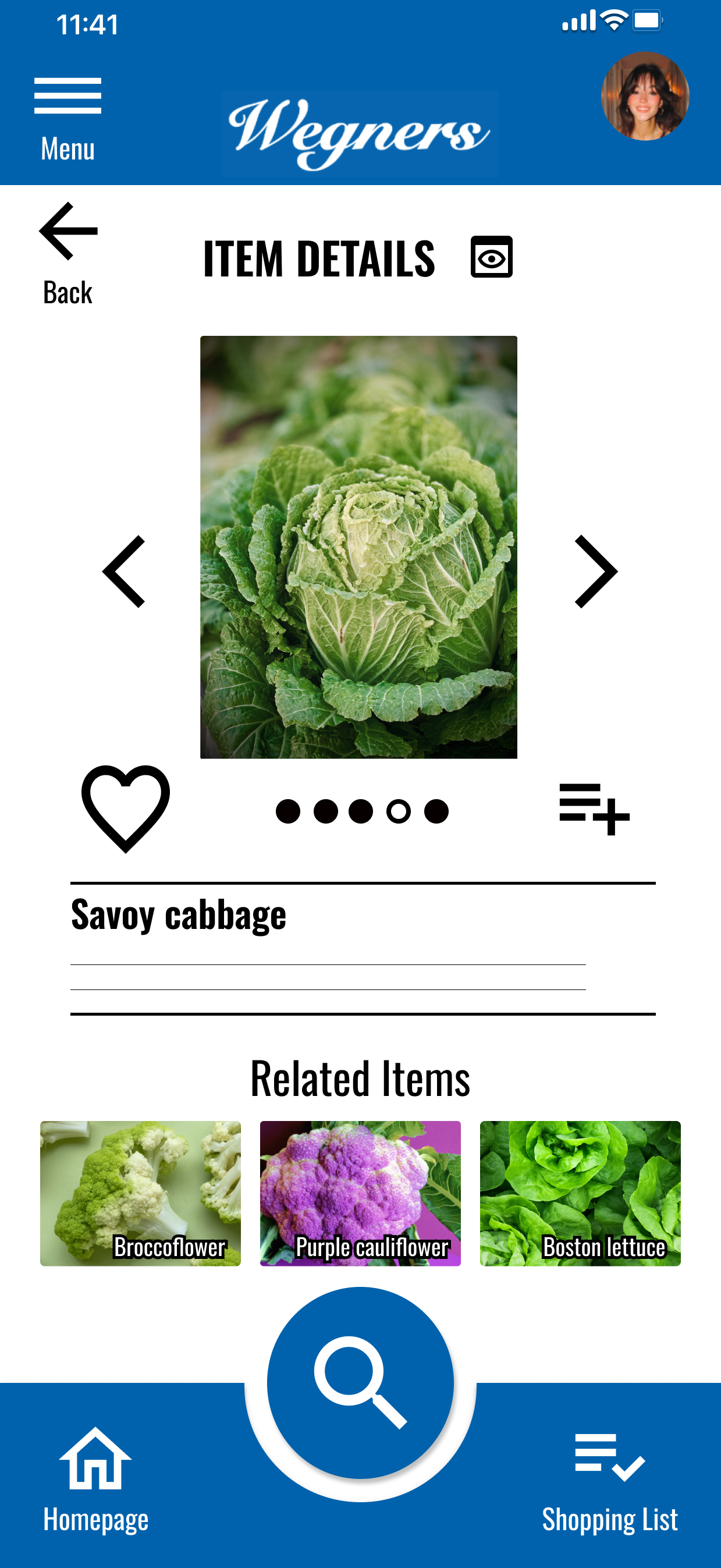
User can access item information in more than one way and through more than one path
Scaling, proportion, and image layout does not appear overcrowded
Low-Fidelity Prototype
Basic copy and some typical screen elements added to assist in alignment
User may navigate using conventionally shaped buttons in easy-to-find, typical locations
Findings from Usability Studies
Round 1 findings:
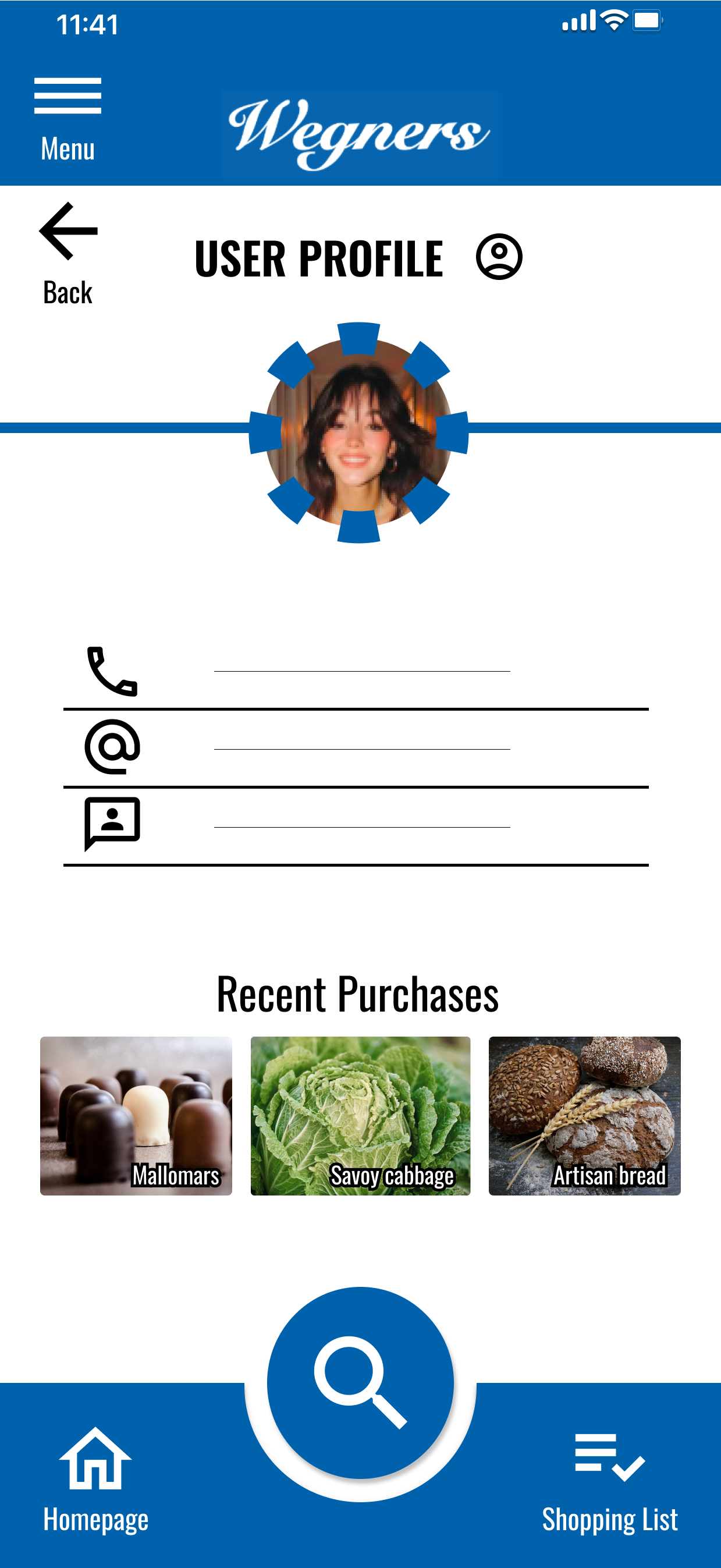
Users want to be able to create an account profile
Users want a ‘shopping list’ to keep track of items they plan to purchase
Users want a button to move back in the flow from their current page
Round 2 findings:
Orphan screen, no access point
Users want button labels
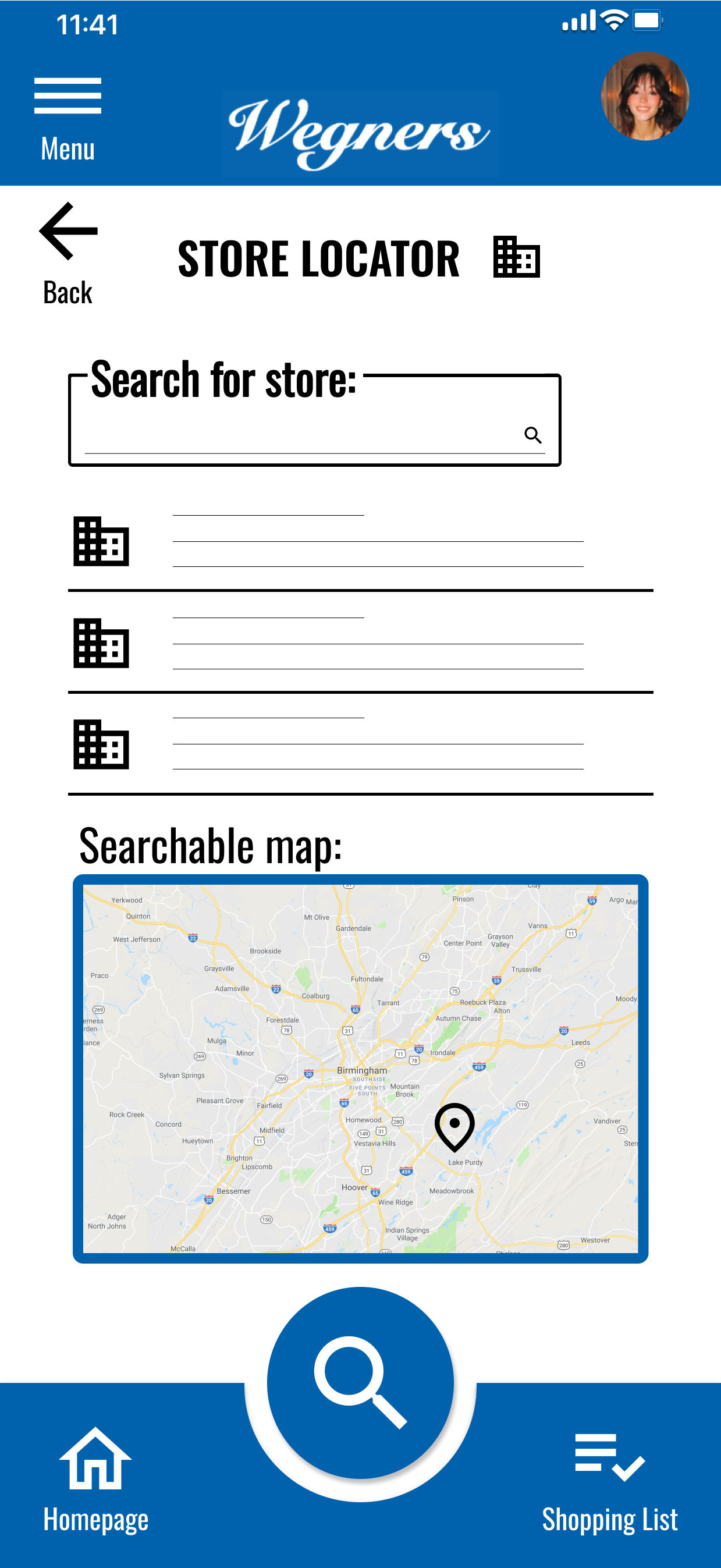
Users indicated that it may be helpful to be able to search for a specific store location from within the app
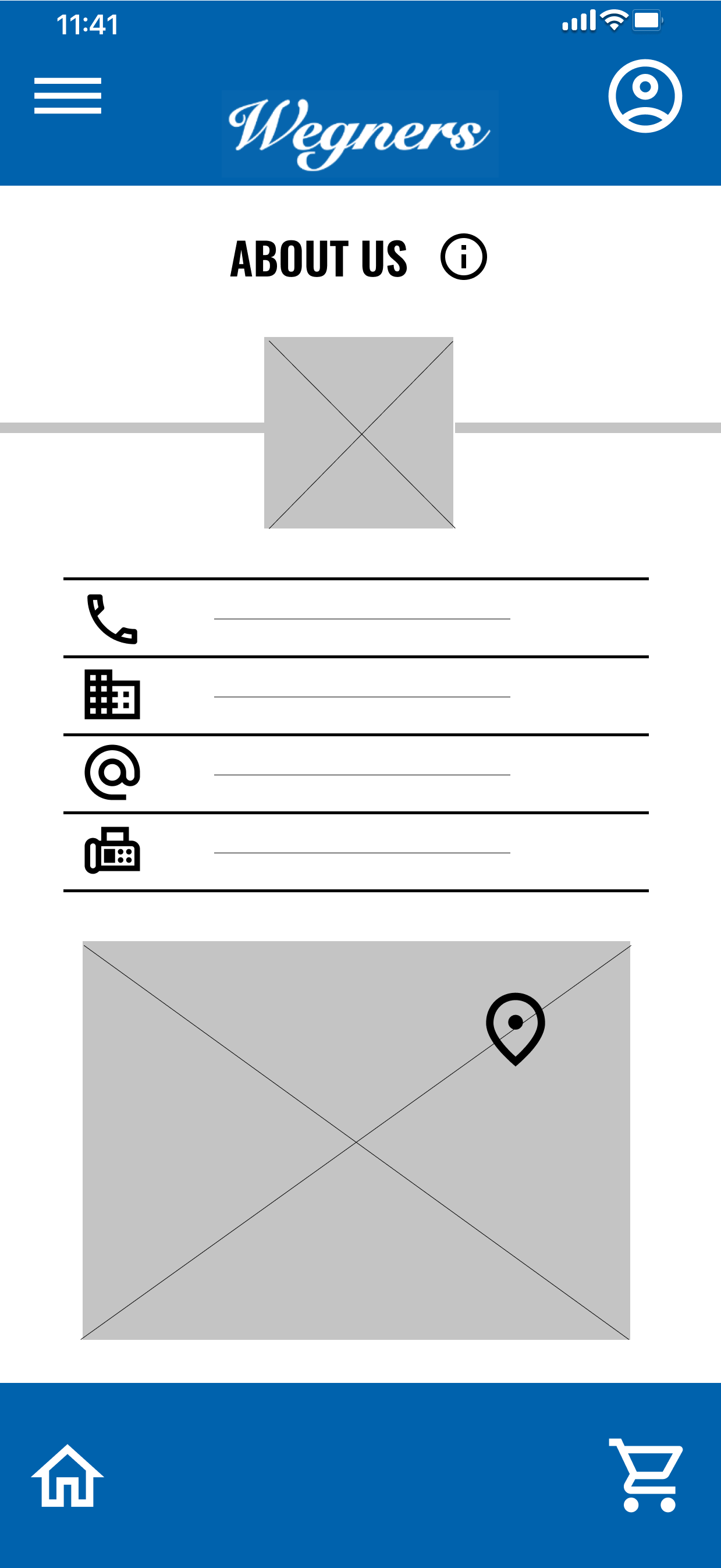
Mock-Ups
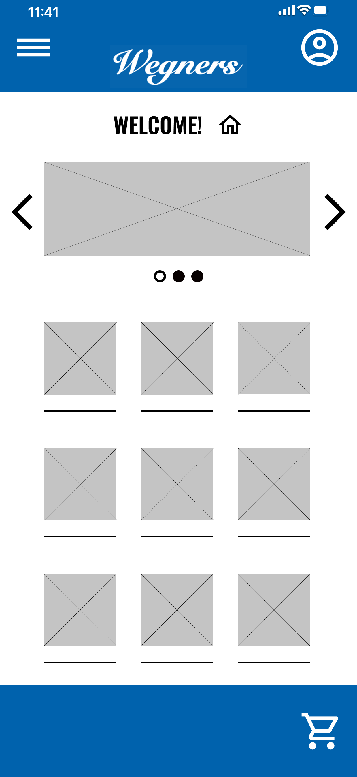
Additional screens (e.g., shopping list, user profile, and more)
Button placed for moving back through navigational flow
After 1st round of usability studies:
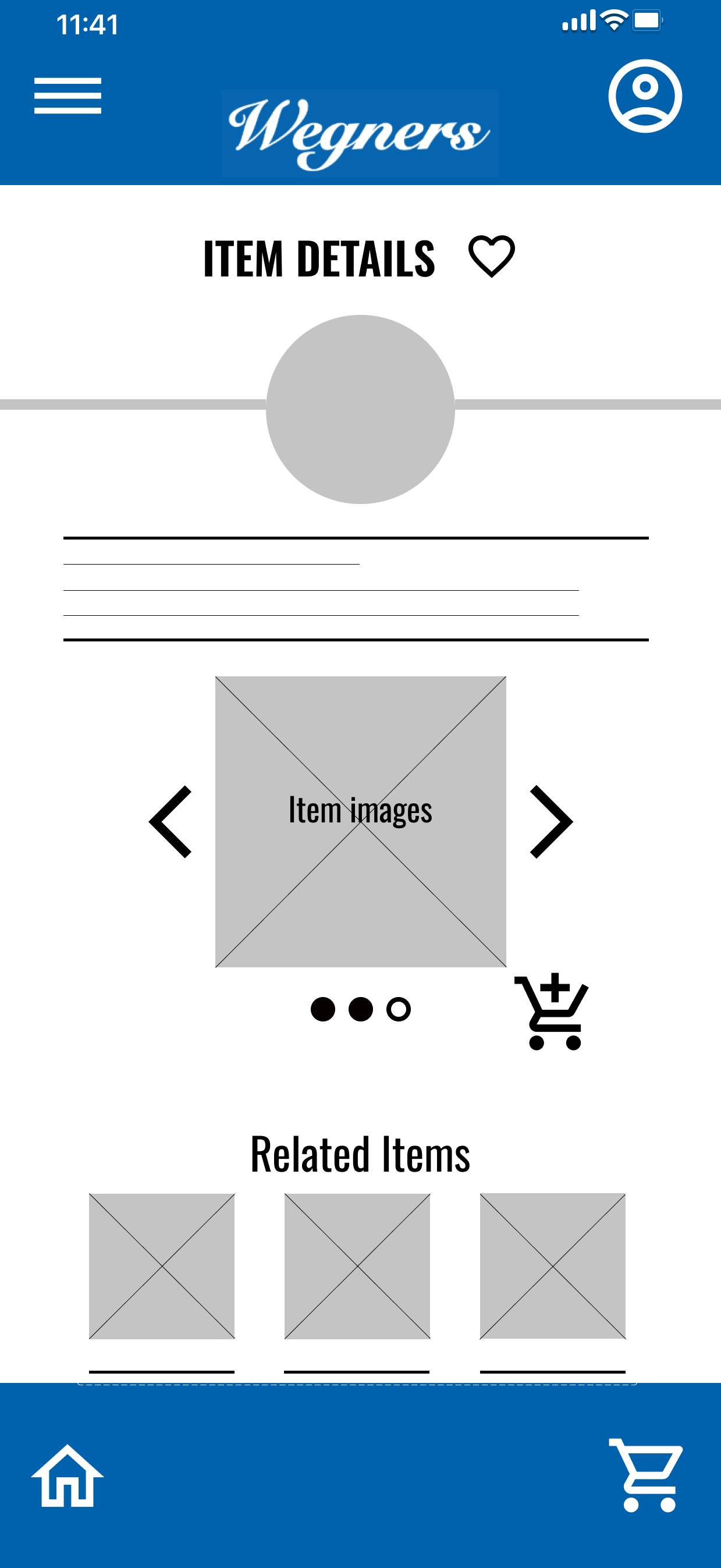
Mock-Ups
Button labels for increased accessibility
Screen added to assist with finding store locations
After 2nd round of usability studies:
Other Mock-Ups
High-Fidelity Prototype
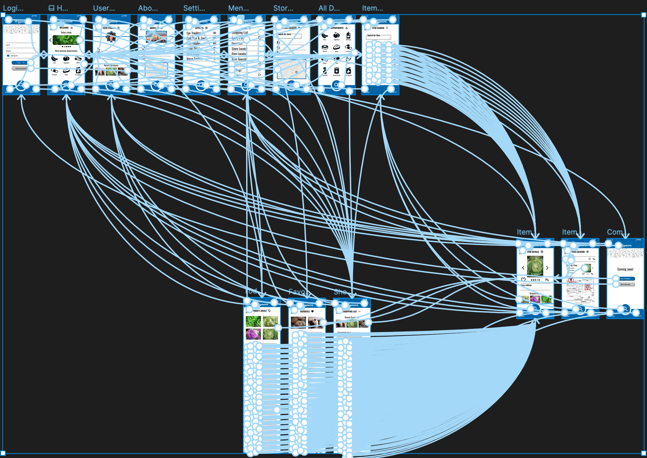
Functional components, clickable prototype
Shown with interactive connections
Designed using Figma
Information Architecture
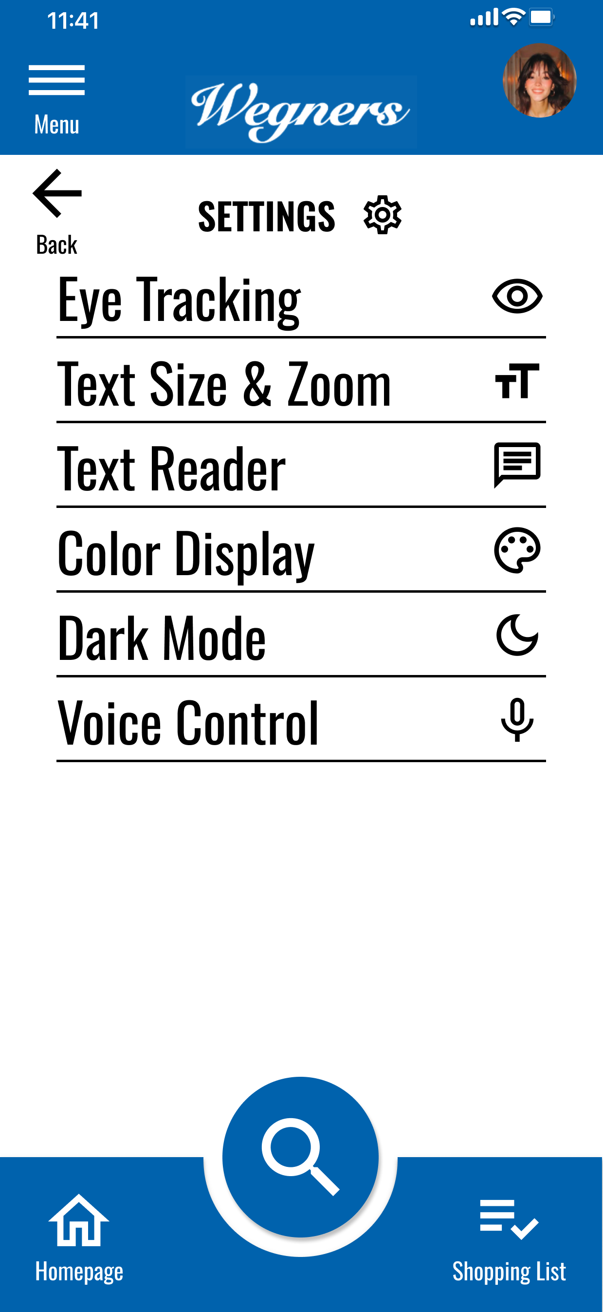
Accessibility Considerations
Button labels and additional buttons introduced to improve navigational flow, consistency across screens
Emphasis (size, color, and contrast) added to bring greater awareness to the placement of call-to-action buttons
Eye-tracking functionality, ability to adjust text size & zoom features, text reader enabled, ability to modulate the color display, dark mode toggle, and voice control activation
Takeaways
Impact:
App speeds product-finding activities and increases the likelihood that the sought after item is found as users shop in the store
What I learned:
For each individual user, there seems to be a unique manner for navigating the app, what they expect the app to provide, and which specific tasks they employ to achieve their goals while using the app
Next Steps
Users indicated a desire for the app to feature an in-store self-checkout function
Users want to be able to search through previous purchases; not to merely scroll past images of items they’ve previously bought, but to view an order summary and/or receipt
Continue to assess overall functionality, follow-up on usability insights, and make improvements where feasible and viable
To view a slide deck with the full details related to this case study, click the image below: